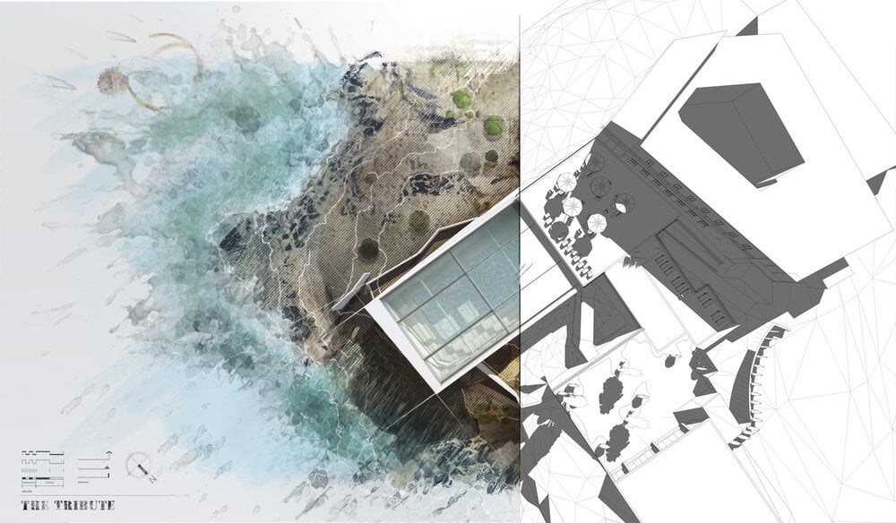
What is a portfolio? in this video I show you how to make a portfolio for Architects, Interns and Students in Adobe Photoshop.
Welcome back to another video in this post we will talk about portfolios, How to make them? And some general tips?
Most people use InDesign so if you know the program go for it but I instead used Photoshop.
1-Software
InDesign will create a minimalist and strict layout which is something very professional and very appealing and easy to understand you can get more creative in portfolio using Photoshop if you want to apply any filters or overlays, and you can basically do the same layout that is in InDesign in Photoshop, but it takes a bit longer and the problem with it is that you have a lot of Photoshop files and a lot of images and you can see that it takes a lot of space.

2-Shape
I have always gone with rectangle only because it’s much easier to layout images and text and if you want to print your portfolio by yourself and you don’t need to do any cutting
3-Size
My portfolio was in a 3d landscape size that’s what the University asked for you don’t have to multiply the width by two so you can create the layouts and then crop them to sheets when you’re done.

4-Resolution
Create your portfolio in a resolution of 300 pixels per inch.

5-Mode
If you plan on physically print in your portfolio which most people do use see why m’kay since this is the mode that printers use and if your images are only going to be viewed digitally or on-screen then use the RGB color mode RGB allows for a higher range of colors to be used
6-Layout
The first thing you need to do to have a consistent layout throughout all of your pages is to start putting your grid of rulers so you need to put a ruler in the center of the layout which represents default of the page and then you put lines on both sides of the page and two lines from the center of the page for binding.

An easy trick to have the spacing equal is to click on the shape tool and type 1 centimeter one centimeter or as much spacing you would like and then you can easily move the rulers to the edge of that shape and then you can crop that shape in half and use that for spacing between the images which creates proportions in your layout the great thing about doing your layout in photoshop is that you can easily see how your pages would look like meaning that you can see in this layout that the colors don’t exactly match so you can easily apply a cooling filter just to make the layout more coherent and you can see that the pictures are not aligned so you can easily fix that with the move tool it’s a really simple detail but it makes a big difference and the font that I use is a babe as new bold and the other option is Bank gothic bold because I mostly do all of my renderings directly onto my Photoshop layout if I’m running behind is that I take a shape and make it to the size and location I want from my work that way I know how many and how big my illustrations or pictures e to be and then you can see your layout and decide on what you need to do so you don’t forget them another way to do your layouts is to put all of your information to the top so you brief the title and if you’re doing it for university maybe your module code and the date or the instructor it’s all up to you and then have all of your images to the bottom and again use the shapes method to figure out how many images do you need and what size they have to be.
When you’re doing your layout you just remember the KISS principle keep it simple stupid, make sure your:
- Pictures are aligned
- No lengthy text
- Pages are are clear and simple
I always look at firms portfolio and basically copy their layouts for their presentation styles.
Links to portfolio:
Download Portfolio -1-
Download Portfolio -2-

